New design work: Radhika Khimji Artist Portfolio

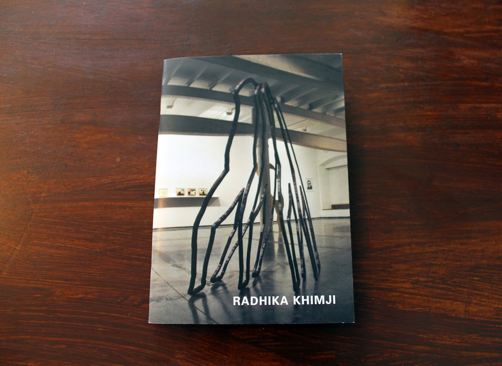
Last year, I had the pleasure of working with London-based artist Radhika Khimji on a portfolio featuring her recent work. I finally got my hands on the printed copy of the portfolio, which I'm generally very happy with (a spine would make it more elegant). Radhika's work is striking and it stands out, which meant the design could not be intrusive – even though the movement of the pieces feel like a composition that would work very well in anything by Hercules & Love Affair. This was the first portfolio for an artist I've worked on, and although I am a big fan of her stuff, I found it much easier to connect with the work after having been able to sit down with the artist in her studio, surrounded by the work, and leafing through her images and note/sketch books. Below are some images from the portfolio.

Typeset: Baskerville and Univers | Size: A5


This generation's 9 1/2 weeks?

I'm supposed to be writing PhD related stuff but I'm going to take a break and write about pop culture instead. While I haven't read the book (nor have any desire to), don't plan on watching the film, nor read the Wikipedia entry, I must say that I believe Fifty Shades of Grey is 9 1/2 Weeks twenty-nine years later (minus the crazy box office numbers). I'm basing this entirely on tidbits I read from the media and the two minute trailer I had to sit through waiting for Inherent Vice at the Barbican.

Now, the film that made stars out of Mickey Rourke and Kim Basinger was apparently met quite negatively at the time, but it is often cited (style! sexy! grimy-ish NYC!) by the younger generations (well, mine at least). There is no questioning it - did you see Kim in it? I'm not going to get into a conversation about what happened to Mickey Rourke, but let's just call it bad decisions. Although 9 1/2 Weeks was not necessarily about BDSM, it was about a sadomasochistic relationship - dealing with ownership of a woman's body and the master/slave relationship which I assume is what Fifty Shades deals with.

Looking back at the trailer of 9 1/2 Weeks now, much of this stuff is likely to creep its way in 14A films as many directors are quick to throw in a sex and/or nudity scene just for the heck of it. As for cast comparisons, I understand there's a lot of factors that go into casting, and despite society's obsession with sex (more heightened than ever apparently), the lead actors are, well, boring and Disneyish. This is very similar to the current music 'superstars'. I am referring here to the likes of Ed Sheeran, who appears to be emulating a look from 'indie' bands from the 2004-2005 period (he reminds me of Billy Talent, Fall Out Boy, American Rejects, Simple Plan, etc.,) and whose 'bad ass' credibility comes in the shape of sleeve tattoos that likely have an image of My Little Pony and other 80s-90s nostalgia; and Sam Smith, who is apparently 22 years old but looks 35 at least, has zero facial expressions, and whose style reminds me of 1980s-90s George Michael minus the charisma.

Back to Fifty vs. 9 1/2: Dakota vs. Kim? Kim wasn't just beautiful, she had style, charm and a certain elegance.
Via

While Dakota may represent exactly the type of character described in the book I have not read, Kim's character wasn't meant to be some vixen either. From the trailer of Fifty Shades I saw, Dakota has none of that electricity Kim brought. In fact, it felt like she belonged in a romantic comedy from the mid to late noughties period alongside Mandy Moore. As for the lead male actor, he's too much of a "I have a job in the City" pretty boy. He has no look in his eyes that gives you a warning that there's something dangerous about him (like Mickey did). I think the celebrities of today are in fact just representations of today's society: boring and extremely PC (you know, in that I am going to stay neutral in person but have an opinion online ONLY kind of way).

Link round-up - 5 February 2015


First link round-up of 2015:

Passages on nostalgia and authenticity


Been doing what feels like endless amounts of reading lately. Came across some fantastic passages, but these two in particular feel more and more relevant to recent conversations I've had (or found myself in!) and posts I've been seeing on social media.


From Undoing Culture: Globalization, Postmodernism and Identity by Mike Featherstone


From Cosmopolitan Vision by Ulrich Beck.

Latest work: Posters for Department of Social Science

I have been working with the Department of Social Science at Goldsmiths these past few months on their upcoming journal. I've also done some design work for other projects within the department organised by the Centre for the Study of Invention and Social Process. Posters found in the elevators of Warmington Tower! I have two others coming up and will post pictures up once I catch them around the college.


Latest work: Nour Festival of Arts 2014


A long project, I was happy to be taken on again to brand the 2014 Nour Festival of Arts. Sticking with the identity created in 2013, I wanted the 2014 catalogue to be different, but recognisable as the festival. The colour has become the key factor in this. For 2014, I used a cobalt blue, which I felt resonated with the Royal Borough of Kensington and Chelsea. Alongside the catalogue, I designed postcards, posters, and standing banners. Will photograph the catalogue properly soon!

Link round-up - 13 November


  • Swingsites for Singles: Fascinating article about a format of housing that thrived during the 1960s.
  • American Psycho Reimagined: A very interesting experiment by two RISD students who emailed the text of Bret Easton Ellis' book back and forth via gmail, and annotated the book with the ads that google generated.
Been enjoying Facebook's "Save for later" option. Here are some picks collected from friends:
  • The History of the Great British Weekender: I've never been to one, but after reading this, I'm intrigued. Great piece on the UK dance scene.
  • This is Color: Facts and history on colours
  • Classical antiquities in colour: There was a point in time when I wondered why there was no colour. But then someone mentioned it to me years ago and I started viewing things completely differently in museums. Funny how we choose to ignore this fact because they look 'uglier'!

Planners

Anyone that knows me knows that I use a planner every day. My planner - or agenda as I grew up calling them - goes with me everywhere. It is filled with notes, to-dos, appointments, books to read, songs to listen to, films to watch, etc. It has a multitude of markings in different colours, random legends, and other doodles. I don't keep track of my diet or other things, it's purely appointments and things to remember. Sometimes there are notes from lectures, meetings, or scribbled information. Stickers are usually adorned on the front or back, but never within the pages.

For 2015, I was looking to step away from my usual Leuchtturm 1917 which I've been using for two years (2013 was hard cover A5 weekly and 2014 is an A6 soft cover daily). It has served me well, but I wanted a change. Previously I used Moleskine, but found something irritating about them. Leuchtturm has been solid (despite the elastic giving out this year), but I wanted something more minimalist, but not super expensive either. I set out on the hunt and found that Japanese planners were ones I've yet to try. I was interested in the Hobonichi Techo since I read about it but where it's available in London it's £35. Ordering online may prove difficult as customs and vat charges might make it more expensive.

I found a B6 mark's storage it daily which was similar but not available in the UK and the web shop is in Japanese (good review of it here). Then I found it on some online shop based in Italy, but after everything it was €38! Too bad...it was perfect. The ones available through Bureau en Direct were weekly and aesthetically didn't appeal to me.

Then I stumbled on a website called Present and Correct which had a large selection, and happened to have a shop near Angel station. I was fond of this one in particular.
It seemed to have everything I wanted in a planner, and with a decent price to (£16.50).

Before having the chance to visit the shop, I stumbled on a Japanese shop in London which sold Midori while walking aimlessly in Central London. These seemed like the perfect mix, even though the paper and aesthetic of the planners weren't convincing. Thinking my mind was set, I headed over to Present and Correct the next day, to get a feel for the products. After debating for about twenty minutes, getting upset over some translation issues in some of the planners, and discussing with a semi helpful shopkeeper (you'd think he would be more interested since I was the only customer there), I decided to go with my initial choice from Delfonics. The brand has a minimal aesthetic, although there are a few things that, as a designer, get to you. I realised after I purchased this that I had a folder from this brand which I bought years ago at the ACE hotel in NYC.

Weekly pages - horizontal
 The planner itself is basic and it has all the essentials: monthly view, weekly view, and notes pages. On the monthly views, there is a section for a to-do list, which is great. In the back, you'll find some maps of metros - Paris and Tokyo. The cover is in German so it's weird that Paris is there. One issue is that it has those removable edges rather than a bookmark, and those remind me of planners from elementary school days. The Japanese like their cases - and this one comes with a plastic case. Now it's not the most pleasing looking thing, but I've decided to keep it on the lenin cover because it has pockets to put stuff in and a pen holder (super helpful). This is great because it's all added extras with the Midori. I've given it a try - re-entering some 2014 appointments (it starts October 2014). The paper is nice, but thin, which means rollerball pens bleed over. What I like about it is that it has a monthly overview (Leuchtturm and Moleskine only have the 'at a glance'), and just tiny conveniences spread out through the planner. The weekly pages are horizontal, but they have planner (this one) where it's vertical.

Back blank notes pages - square
So far, I think I'm getting readjusted to the whole weekly thing after a year of Daily. I'm also getting adjusted to the hardish cover, being used to the soft leather like one from my previous diary.

For about a year I've played with the idea of developing my own, but my issue is production. Both blurb and lulu can be potential options, since many printers in London would cost a fortune to produce one. Maybe once I get some more time, I'll be able to really work out a design that's absolutely perfect for me.
Metro maps in the back

Scheduling the first few months of 2016

Yearly schedule (2015) at a glance

Bad taste is ubiquitous

The end of September is both a sad and a happy time. It represents the official sad end of summer and the sudden appearance of cold weather. It also represents the somewhat end of wedding season. Now I am not against weddings, but elements of weddings. They continue to prove - through every facebook post and instagram image posted - that people have incredibly terrible taste, and no creativity. Weddings are proof that photographers, wedding planners, and print shops pretending to be design studios, are making a lot of other money and fooling people into thinking their wedding is unique or interesting.

The worst thing about weddings - aside from the predictable elements of each one I've seen recently (prove me wrong people, prove me wrong!) - has got to be the decision to have bridesmaids and groomsmen. This tradition needs to be abolished. I just can't stand looking at the pictures, the unflattering dresses, the mismatched colours...

Then comes other predictable items, the ones that make all weddings seem like clones of each other: the photo booth, the mason jars, the chalk board with bad hand lettering, the typewriter typeface, the 'fun' child-like one, or the calligraphic one, terrible engagement photos, video trailers, and the poses to name a few (you know where everyone's jumping in the air?)...I can't tell weddings apart thanks to these things.

Link round-up - 21 September 2014


I have been writing this round-up for what seems like forever, mainly because I have just never sat down and finished adding all the links! So I added a few more and think that settles it for this week.

"The news is for idiots"

“The news is for idiots” was a comment I saw on someone posting their opinion on a certain situation. This view however is shared by many. It is better to avoid reading it and pretend not to have an opinion on any matter. I decided to briefly analyse my Facebook feed, and describe feelings and actions of those who are ’non-political' (self-proclaimed) on specific events this summer, and on other relevant issues. Here are the results: 

  1. Syria: indifference
  2. ISIS: “we in the civilised world” or indifference
  3. Gaza: indifference or simplified as “Give peace a chance!”
  4. Russia/Ukraine: indifference or “always knew they were corrupt bad guys, Bond told me!”
  5. Ebola: indifference
  6. Brazil: indifference, except of course when it came to the score of the world cup matches
  7. Olympics/World Cup news: as long as those stadiums don’t delay the opening ceremonies, I’m indifferent
  8. Ferguson: Some are outraged, some are completely indifferent
  9. Tim Horton’s being bought out by Burger King: mild outrage
  10. Gay rights: If there’s a party, I’m there!
  11. Canadian government making atrocious decisions: mild uproar
  12. Rob Ford smokes crack: outrage
  13. Airline crashes: mild indifference or trip cancellations or boycotting the airline
  14. Celebrity death (A to C list): devastation
  15. Parking ticket: outrage
  16. Aboriginals: "I guess it’s important, but I really don’t know anything"
  17. A TV show gets cancelled: sadness, calls for a Kickstarter to be created begin
  18. Reduction of cycling lanes: outrage
  19. Someone smoking on a non-smoking patio: more outrage than drunk driving
  20. The weather: depends on if it’s good or bad
  21. Ben Affleck as Batman: petitions signed
  22. Justin Bieber’s behaviour: petitions signed
  23. Cell-phone provider policies: blind rage
  24. Ice bucket challenge: “yay looks fun, and I’m doing good!” “What’s ALS?” “Why are people wasting water?” And of course, moral superiority that we waste water in other ways, why is this any different?
  25. Jennifer Lawrence nude photos leak: moral superiority

Link round-up: 21 August 2014

A collection of interesting links from around the internet:
  • A look at the transformation of the music industry. Whereas the GIF is going way too quick for anyone to actually read the graph, they do offer separate links to each year. 
  • Why contemporary art is exclusionary. A very interesting discussion on how contemporary art is becoming more exclusionary. I would also argue that it is becoming commercialised in a very different way: it's becoming a larger interest in the mainstream (Marina/Jay-Z as one)
  • To kill or not to kill comments...that is the question. A friend once said "before the internet, did Trolls write letters to the editor everyday?" Comments are useful, but can also be violent and awful.
  • Rebel Architecture. A new six-part series coming soon to Al-Jazeera (link leads to trailer and some information on the series). Lots of interest recently around "activist architecture", "architecture without architects", and being "against" a certain form of architecture.

Currently listening - August 2014

June and July saw Rhye, Todd Terje, Maurice Fulton, and Blood Orange on loop but on the playlist these days is leaning towards some great throwbacks:
  • "8 Ball" by Underworld

  • "Is it good to you" by Heavy D & the Boyz

  • "I'm not feeling you" by Yvette Michelle (remember Funkmaster Flex's "The Mix Tape Volume II 60 Minutes of Funk"?)

  • "Rock the Discotheque" by Justin Winks vs. Casio Social Club

  • "New York" by Kerrier District

  • "Strawberry Bubblegum" by Justin Timberlake


  • "Clairevoyage" by Mungolian Jet Set's 16th Rebels Of Mung (Ft. Lindstrom & Dominique Leone) - absolutely adore this one since I heard it on Skatebard's mix for Sid Loves Turbo back in 2007. Can't find a YouTube video or sound cloud, but I've embedded Skatebard's mix for Sid Loves Turbo. The song starts at 07:30 (the whole podcast is worth a listen)


  • "Bad Girls" by Donna Summer (I blame watching Arrested Development...this played twice and just got stuck in my head!)