Umberto Eco on personalising books


In his recently translated How to Write a Thesis, Umberto Eco – who passed away this past February – wrote this about personalising books. I've always been a serial underliner – but I've yet to follow his advice on colours. This book is an invaluable resource and I highly recommend it. Even though some say it is dated as Eco discusses his method of using index cards for references, the task is to incorporate these methods into the ways we deal with citations in 2016. While I use a number of software for saving my arguments, quotations, and notes on things I've read (Evernote, PapersApp and formerly Zotero and Mendeley), sometimes the infinite amount of tools at my disposal means that I've lost a lot of information because I can no longer find it. Perhaps a box with index cards sorted alphabetically isn't a bad idea...but I'm still trying to incorporate this digitally.

Towards a Locally-Centric Design Education Curricula

Last month, I presented my ongoing PhD research at the Lab at Darat Al Funun in Amman. Over 35 designers and non-designers turned out to the event and asked some great questions. Many thanks to the Amman Design Week team who helped promote and organise the event and who tweeted about it (#DEJ16), as well as to the people at Darat Al Funun for providing me with the space. Watch the entire talk below.

Transform

A view of Amman and the Roman theatre from the citadel

The last time I was in Amman, I landed on the 11th of February 2011. After spending 12 hours in the air without internet or phone coverage, I turned on my BlackBerry Torch and received a text message from a friend. The text said 'congratulations, he stepped down.' I smiled...Mubarak finally did it. That night, I drove around Amman with my uncle and my cousin looking for knafeh to celebrate, but the entire city had the same idea, and they ran out of knafeh.

Winters in Amman were very different from the summers. Summers were characterised by heavy traffic from Jordanians living abroad visiting family and Khaleejis spending their summer holidays in the city due to its relative stability. The roads in winter were quiet. For anyone visiting, it felt as though it was you and the locals only.

Five years later, I land in a new airport with an expired Jordanian passport. I glance over at the visa queue and notice that the visa for foreigners had doubled since my last visit (40JD). I try my luck with the officer and he lets me on the expired passport but reminds me to renew it. The new airport is nice and quiet. Rather than Arial Arabic that floods most Arab cities (let's call it the official typeface of the Arab region), nice type in both Arabic and English grace the signs.
Roof of Queen Alia International Airport

In Amman, the car is king. The streets are confusing and I'm not sure how people know where they are going here, but they do. As I drive through the streets – always as a passenger – I notice the new shiny towers that dot the skyline. Last time, the 'new downtown' – Abdali – was merely scaffolding plastered with images of happy people, shopping malls, and new ‘possibilities.’ Today, this new ‘possibility’ has been revealed, and it's tall towers, hotels, shops, the boulevard, and other buildings that aim to attract businesses able to afford the price tag. Abdali is the latest GCC inspired and funded construction project roaring through Arab cities. Five years ago, the under-construction Jordan Gate Towers towered over the skyline. In 2016, a few more floors have been built, but they remain unfinished and already look dated.
Le Royal hotel and the Zara Towers on a gloomy day

The events of the past five years have taken a huge toll on the city and the country as whole, with Arabs from all over the region seeking refuge in it. It remains incredibly expensive with a high currency, low salaries, and the mysterious 16 per cent tax. This has also turned traffic into a 24/7 ordeal. The amount of cars has increased, yet the roads have not been expanded. Whatever, when there’s only two lanes, Jordanians turn this into four to ‘maximise’ space! Taxis have gotten worse – they don't take you where you want to go but where they want to go. Luckily for me, Uber – while I do not agree with many of their practices and I was reluctant to use them – saved me from being stranded somewhere in Jabal Weibdeh. Public transportation remains bad as always, and the sign of hope from 2010 – the rapid bus transit lanes that were being built – now sit empty. “Why is public transportation so bad in this country?” I asked. “Because why would we want Jordanians to connect to each other easily?" a friend replied sarcastically. Unfortunately, Amman is huge, its sidewalks are not great and contain a number of obstacles, and it's all hills, therefore walking is not an option.
The view from Darat Al-Funun in Jabal Weibdeh
Amman’s challenge is that it is a city reduced to stereotypes and clichés. It is often described by these stereotypes and clichés by people who have never even stepped foot in it. When I was younger, I disliked it. It was boring and austere. That was Amman in the late 1990s – full of Lada's, incredibly tall sidewalks, coffee shops, 3amo's in green suits and oversized leather jackets, houses that were freezing in the winter, women wearing brown lip liner, and boys sporting way too much hair gel. Ten years went by before my next visit. This time, I made friends, and thought, while there still isn't as much to do, it's easy to make friends here, and that makes it tolerable and fun. I didn't love it, but I didn't dislike it either.

Amman is an Arab city: the streets are tight, the traffic is ridiculous, the car dominates because public transit is rubbish, Hyundai's and Kia's flood the streets, people walk on the street rather than the sidewalks, everything is infuriating, the food is great, people are nosey, water runs out, signage is either in Arabic or bilingual and the English is often misspelled, the law exists but isn't implemented, things are broken and hazardous, people cross the street as if they have a death wish, street names are decorative, google maps is not accurate...the list goes on. But the city has a certain charm in the spring. The rain has made the hills green and cleaned the city.

On this more recent trip, I was driving around, the sun shining beautifully through the window, a black plastic bag flying in the sky (let's call it the official bird of the Arab world), and I imagined, for a slight second, that I'd spot the beach. Then I realised where I was and that I was probably hallucinating from being in the car for so long, but it hit me: water was Amman's missing ingredient.

Accumulation

Three years in London, three years since I began my PhD. Time flies. Since then, I've finished over 20 notebooks/agendas cover to cover...


31 minutes on Bond Street

11.58 – I get off the Central Line at Bond Street. I almost suffocated on the train. Everyone's smelling like a Fish & Chips shop these days. There came a certain point in time in 2012, when I first moved to London, where the carriage was empty (only once or twice really). Until the Crossrail opens, this is going to get worse.

11.59 – Walking towards the exit I notice the exit sign is written in almost every European language. I'm surprised – judging by our proximity to Edgware Road and Selfridge's – that Arabic is not on the sign.

12.01 – I'm starving so I pass by the only editable quick place to eat nearby, Prêt, but it's packed and everything has ham in it.

12.05 – I'm walking in the direction of high end shops. This means I pass by Trésor Rare and avoid the sales lady yelling "excuse me hello" about three times. The Swiss-shop sells creams that make your skin for the affordable price of £900. I once got dragged in there by a pushy salesman, who went down to £150 (!!!) for an under-eye cream. I took the samples and told him I'd think about it. I'm nouveau pauvre (the student/creative with champagne taste on a beer budget that make impulse purchases), but not that nouveau pauvre.

12.07 – Someone with an umbrella that says 'European wealth' passes me. There are many rich tourists trekking through the rain. Many of them are tacky, nouveau riche types. I pass Fenwick. Of course rich Arabs are entering.

12.08 – Rich tourist with tacky Fendi luggage and umbrella almost takes me out by not paying attention. She didn't even notice it happened.

12.09 – I spot EAT. I got inside, pick a brie, basil and tomato sandwich and an Americano and sit down. I'm not sure why anyone with options chooses to eat here. I have little time, nor do It work nearby so I'm here. The others? Not sure.

12.12 – A woman asks to share my table. I have no problem with that. She's North American but our encounter is so brief I can't figure out where she's from. She's into her phone. She eat her meal, makes zero eye contact. English training.

12.29 – She gets up, wipes the bread crumbs off, says 'thank you' and walks into the anonymous city. 

A Manifesto of Change or Design Imperialism? A Look at the Purpose of the Social Design Practice

In June 2014, I had the opportunity to present my paper "A Manifesto of Change or Design Imperialism? A Look at the Purpose of the Social Design Practice" at the STS Italia conference 'A Matter of Design' in Milan, Italy. The proceedings were published a few months ago, and I'm happy to announce that my paper is available to read for free in the proceedings.

The proceedings can be found here: http://www.stsitalia.org/?p=1548&lang=en, and the paper is on pp. 245-260.

It's wonderful to see the journey the ideas within this paper have taken in the past three years. The idea started off through discussions with a colleague during our MA in Social Design at MICA, then evolved to a short presentation for the Goldsmiths Graduate Festival in May 2013, reworked for the STS Italia conference, and then reworked again for the proceedings. It's also making an altered appearance in Beirut next month as part of the Beirut Design Week International Conference (2-3 June 2015). I'm looking forward to presenting it in a non-academic oriented conference.

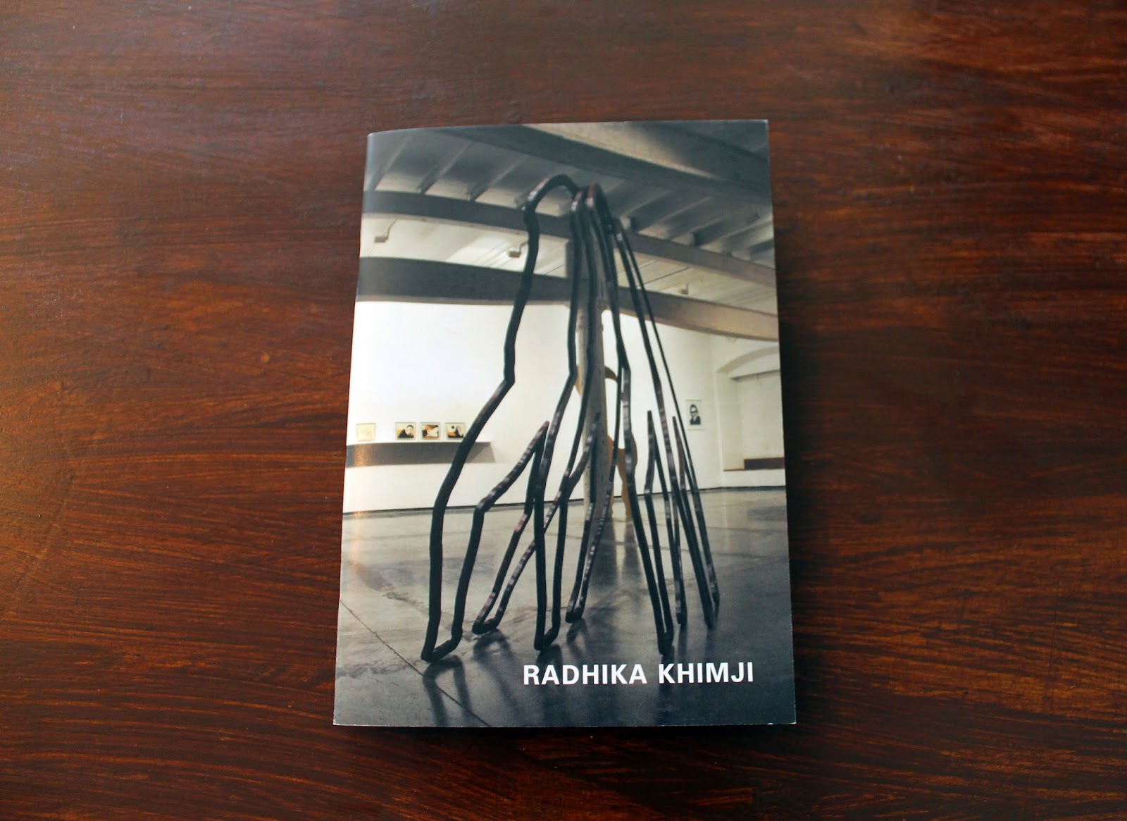
New design work: Radhika Khimji Artist Portfolio

Last year, I had the pleasure of working with London-based artist Radhika Khimji on a portfolio featuring her recent work. I finally got my hands on the printed copy of the portfolio, which I'm generally very happy with (a spine would make it more elegant). Radhika's work is striking and it stands out, which meant the design could not be intrusive – even though the movement of the pieces feel like a composition that would work very well in anything by Hercules & Love Affair. This was the first portfolio for an artist I've worked on, and although I am a big fan of her stuff, I found it much easier to connect with the work after having been able to sit down with the artist in her studio, surrounded by the work, and leafing through her images and note/sketch books. Below are some images from the portfolio.

Typeset: Baskerville and Univers | Size: A5


This generation's 9 1/2 weeks?

I'm supposed to be writing PhD related stuff but I'm going to take a break and write about pop culture instead. While I haven't read the book (nor have any desire to), don't plan on watching the film, nor read the Wikipedia entry, I must say that I believe Fifty Shades of Grey is 9 1/2 Weeks twenty-nine years later (minus the crazy box office numbers). I'm basing this entirely on tidbits I read from the media and the two minute trailer I had to sit through waiting for Inherent Vice at the Barbican.

Now, the film that made stars out of Mickey Rourke and Kim Basinger was apparently met quite negatively at the time, but it is often cited (style! sexy! grimy-ish NYC!) by the younger generations (well, mine at least). There is no questioning it - did you see Kim in it? I'm not going to get into a conversation about what happened to Mickey Rourke, but let's just call it bad decisions. Although 9 1/2 Weeks was not necessarily about BDSM, it was about a sadomasochistic relationship - dealing with ownership of a woman's body and the master/slave relationship which I assume is what Fifty Shades deals with.

Looking back at the trailer of 9 1/2 Weeks now, much of this stuff is likely to creep its way in 14A films as many directors are quick to throw in a sex and/or nudity scene just for the heck of it. As for cast comparisons, I understand there's a lot of factors that go into casting, and despite society's obsession with sex (more heightened than ever apparently), the lead actors are, well, boring and Disneyish. This is very similar to the current music 'superstars'. I am referring here to the likes of Ed Sheeran, who appears to be emulating a look from 'indie' bands from the 2004-2005 period (he reminds me of Billy Talent, Fall Out Boy, American Rejects, Simple Plan, etc.,) and whose 'bad ass' credibility comes in the shape of sleeve tattoos that likely have an image of My Little Pony and other 80s-90s nostalgia; and Sam Smith, who is apparently 22 years old but looks 35 at least, has zero facial expressions, and whose style reminds me of 1980s-90s George Michael minus the charisma.

Back to Fifty vs. 9 1/2: Dakota vs. Kim? Kim wasn't just beautiful, she had style, charm and a certain elegance.
Via

While Dakota may represent exactly the type of character described in the book I have not read, Kim's character wasn't meant to be some vixen either. From the trailer of Fifty Shades I saw, Dakota has none of that electricity Kim brought. In fact, it felt like she belonged in a romantic comedy from the mid to late noughties period alongside Mandy Moore. As for the lead male actor, he's too much of a "I have a job in the City" pretty boy. He has no look in his eyes that gives you a warning that there's something dangerous about him (like Mickey did). I think the celebrities of today are in fact just representations of today's society: boring and extremely PC (you know, in that I am going to stay neutral in person but have an opinion online ONLY kind of way).

Link round-up - 5 February 2015


First link round-up of 2015:

Passages on nostalgia and authenticity


Been doing what feels like endless amounts of reading lately. Came across some fantastic passages, but these two in particular feel more and more relevant to recent conversations I've had (or found myself in!) and posts I've been seeing on social media.


From Undoing Culture: Globalization, Postmodernism and Identity by Mike Featherstone


From Cosmopolitan Vision by Ulrich Beck.

Latest work: Posters for Department of Social Science

I have been working with the Department of Social Science at Goldsmiths these past few months on their upcoming journal. I've also done some design work for other projects within the department organised by the Centre for the Study of Invention and Social Process. Posters found in the elevators of Warmington Tower! I have two others coming up and will post pictures up once I catch them around the college.


Latest work: Nour Festival of Arts 2014


A long project, I was happy to be taken on again to brand the 2014 Nour Festival of Arts. Sticking with the identity created in 2013, I wanted the 2014 catalogue to be different, but recognisable as the festival. The colour has become the key factor in this. For 2014, I used a cobalt blue, which I felt resonated with the Royal Borough of Kensington and Chelsea. Alongside the catalogue, I designed postcards, posters, and standing banners. Will photograph the catalogue properly soon!

Link round-up - 13 November


  • Swingsites for Singles: Fascinating article about a format of housing that thrived during the 1960s.
  • American Psycho Reimagined: A very interesting experiment by two RISD students who emailed the text of Bret Easton Ellis' book back and forth via gmail, and annotated the book with the ads that google generated.
Been enjoying Facebook's "Save for later" option. Here are some picks collected from friends:
  • The History of the Great British Weekender: I've never been to one, but after reading this, I'm intrigued. Great piece on the UK dance scene.
  • This is Color: Facts and history on colours
  • Classical antiquities in colour: There was a point in time when I wondered why there was no colour. But then someone mentioned it to me years ago and I started viewing things completely differently in museums. Funny how we choose to ignore this fact because they look 'uglier'!

Planners

Anyone that knows me knows that I use a planner every day. My planner - or agenda as I grew up calling them - goes with me everywhere. It is filled with notes, to-dos, appointments, books to read, songs to listen to, films to watch, etc. It has a multitude of markings in different colours, random legends, and other doodles. I don't keep track of my diet or other things, it's purely appointments and things to remember. Sometimes there are notes from lectures, meetings, or scribbled information. Stickers are usually adorned on the front or back, but never within the pages.

For 2015, I was looking to step away from my usual Leuchtturm 1917 which I've been using for two years (2013 was hard cover A5 weekly and 2014 is an A6 soft cover daily). It has served me well, but I wanted a change. Previously I used Moleskine, but found something irritating about them. Leuchtturm has been solid (despite the elastic giving out this year), but I wanted something more minimalist, but not super expensive either. I set out on the hunt and found that Japanese planners were ones I've yet to try. I was interested in the Hobonichi Techo since I read about it but where it's available in London it's £35. Ordering online may prove difficult as customs and vat charges might make it more expensive.

I found a B6 mark's storage it daily which was similar but not available in the UK and the web shop is in Japanese (good review of it here). Then I found it on some online shop based in Italy, but after everything it was €38! Too bad...it was perfect. The ones available through Bureau en Direct were weekly and aesthetically didn't appeal to me.

Then I stumbled on a website called Present and Correct which had a large selection, and happened to have a shop near Angel station. I was fond of this one in particular.
It seemed to have everything I wanted in a planner, and with a decent price to (£16.50).

Before having the chance to visit the shop, I stumbled on a Japanese shop in London which sold Midori while walking aimlessly in Central London. These seemed like the perfect mix, even though the paper and aesthetic of the planners weren't convincing. Thinking my mind was set, I headed over to Present and Correct the next day, to get a feel for the products. After debating for about twenty minutes, getting upset over some translation issues in some of the planners, and discussing with a semi helpful shopkeeper (you'd think he would be more interested since I was the only customer there), I decided to go with my initial choice from Delfonics. The brand has a minimal aesthetic, although there are a few things that, as a designer, get to you. I realised after I purchased this that I had a folder from this brand which I bought years ago at the ACE hotel in NYC.

Weekly pages - horizontal
 The planner itself is basic and it has all the essentials: monthly view, weekly view, and notes pages. On the monthly views, there is a section for a to-do list, which is great. In the back, you'll find some maps of metros - Paris and Tokyo. The cover is in German so it's weird that Paris is there. One issue is that it has those removable edges rather than a bookmark, and those remind me of planners from elementary school days. The Japanese like their cases - and this one comes with a plastic case. Now it's not the most pleasing looking thing, but I've decided to keep it on the lenin cover because it has pockets to put stuff in and a pen holder (super helpful). This is great because it's all added extras with the Midori. I've given it a try - re-entering some 2014 appointments (it starts October 2014). The paper is nice, but thin, which means rollerball pens bleed over. What I like about it is that it has a monthly overview (Leuchtturm and Moleskine only have the 'at a glance'), and just tiny conveniences spread out through the planner. The weekly pages are horizontal, but they have planner (this one) where it's vertical.

Back blank notes pages - square
So far, I think I'm getting readjusted to the whole weekly thing after a year of Daily. I'm also getting adjusted to the hardish cover, being used to the soft leather like one from my previous diary.

For about a year I've played with the idea of developing my own, but my issue is production. Both blurb and lulu can be potential options, since many printers in London would cost a fortune to produce one. Maybe once I get some more time, I'll be able to really work out a design that's absolutely perfect for me.
Metro maps in the back

Scheduling the first few months of 2016

Yearly schedule (2015) at a glance