Showing posts with label graphic design. Show all posts

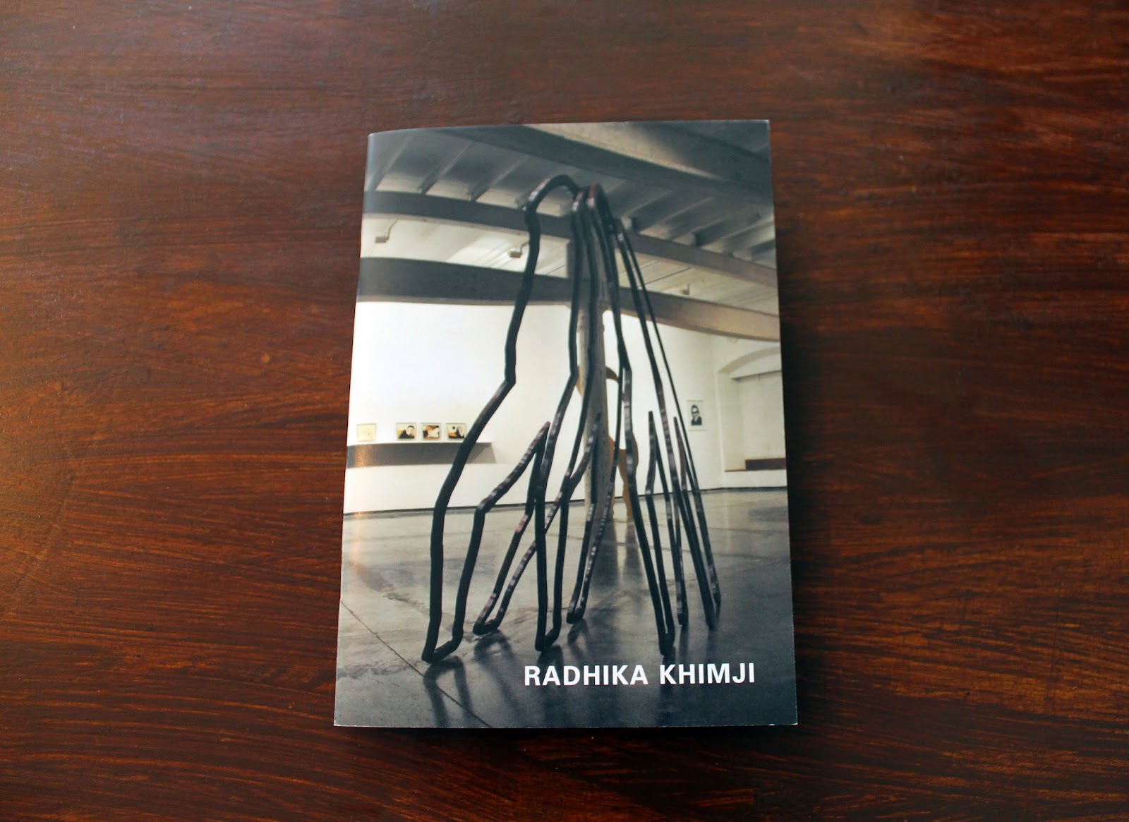
New design work: Radhika Khimji Artist Portfolio

Last year, I had the pleasure of working with London-based artist Radhika Khimji on a portfolio featuring her recent work. I finally got my hands on the printed copy of the portfolio, which I'm generally very happy with (a spine would make it more elegant). Radhika's work is striking and it stands out, which meant the design could not be intrusive – even though the movement of the pieces feel like a composition that would work very well in anything by Hercules & Love Affair. This was the first portfolio for an artist I've worked on, and although I am a big fan of her stuff, I found it much easier to connect with the work after having been able to sit down with the artist in her studio, surrounded by the work, and leafing through her images and note/sketch books. Below are some images from the portfolio.

Typeset: Baskerville and Univers | Size: A5


Latest work: Posters for Department of Social Science

I have been working with the Department of Social Science at Goldsmiths these past few months on their upcoming journal. I've also done some design work for other projects within the department organised by the Centre for the Study of Invention and Social Process. Posters found in the elevators of Warmington Tower! I have two others coming up and will post pictures up once I catch them around the college.


Latest work: Nour Festival of Arts 2014


A long project, I was happy to be taken on again to brand the 2014 Nour Festival of Arts. Sticking with the identity created in 2013, I wanted the 2014 catalogue to be different, but recognisable as the festival. The colour has become the key factor in this. For 2014, I used a cobalt blue, which I felt resonated with the Royal Borough of Kensington and Chelsea. Alongside the catalogue, I designed postcards, posters, and standing banners. Will photograph the catalogue properly soon!

Don’t judge books by their cover – especially Arab works in translation| The National

Don’t judge books by their cover – especially Arab works in translation | The National

As a designer, I felt annoyed while reading this article. Despite agreeing with a lot of the author’s points, I also felt that it would’ve given it something more if she had bothered interviewing designers who work for these publishers. The fact is designers rarely have a final say when it comes to marketing. This neglect of a designer’s opinion makes us designers yet again seem irrelevant in the process.

The blame cannot just be put on marketing when it comes to stereotypical covers however - authors and translators likely play a role in constructing the brief. As a designer, I can’t tell you how many clients (both Arab and non-Arabs, both educated about the region and those merely interested in it) have asked me for “Arabian looks” that are nothing more but silly stereotypes. Yes people do judge books based on their cover: the proof that good design works is everywhere. When I browse a bookshop and come across books in translation, I often shake my head in disapproval. Frankly, I question a publisher who has the nerve to favour marketing over content.

I’m not saying designers are innocent either: the fact that the design profession is so reliant on the client allows this to happen. Rarely do designers question this unquestioned service to clients (it is their paycheque after all), or argue against the contents of a brief. But this is also the problem with universal/standard design. I’m certain when designers think of the Arab region the first imagery available to them is arabesque, veils, mosques, camels, turbans, and geometry. Context is everything - there is no one size fits all solution.

I believe that publishers need to start thinking about having teams of designers designated to work on specific regions - designers that are aware of the places they are designing about. Or better yet, publishers should hire an experienced and knowledgeable freelancer familiar with a specific region and who is capable of giving them an informed critique. Either way, designing book covers is like translation: the wrong choice can alter the meaning completely.
Kalimat Issue 09

Hard to believe it has been three and a half years and nine issues. Kalimat Issue 09 is out - and it’s back in our initial format: online! Read it here: http://bit.ly/1gG2JZS and for a limited time, you can download a free PDF version. Of course, don’t forget the podcast: http://bit.ly/1l7A53o (free to download or stream)

Kalimat | Issue 09 - Vol. IV
Kalimat is an open outlet for political, social, and cultural expression for Arabs across the region and the diaspora to share their ideas and work. www.kalimatmagazine.com

Portfolio

Portfolio

Although there’s still more work to do, I’ve finally gotten around to updating my portfolio and adding some new work. Check it out by clicking on the portfolio link up top!

In the City

The design and sound art exhibition I’m organising In the City, opens on 26 September at P21 Gallery in London. The Private View takes place on 25 September from 18.30-20.30. Details of the private view and exhibition available at kalimatmagazine.com/inthecity

Fantastic Man vs. Adam Levant

A few months back, I found myself in a waiting area sitting next to a famous graphic designer. This designer, who was formerly a big magazine collector, told me that he hates magazines because, “they all look like, or try to look like, Fantastic Man to me.”

While looking through Antoine bookshop in Beirut last week, I stumbled on “Adam Levant,” a magazine “for the man of the Middle East.” I snapped this shot to show you just how much this attempts to look like Fantastic Man, in both design and concept…guess the magazine cynic was right.

The history of typography


Great video on the History of Typography by Ben Barrett-Forrest. Apparently, it took 140 hours of work, 2,454 pictures, and 291 paper cut outs for the 5 minute animation.

Errday I'm curatin'


Latest work - now that this has been gifted, it can be made public! A take on the word “curator” and its misuse nowadays.

Size : A2 printed on uncoated matte 180gsm

Graphic Design Criticism as a Spectator Sport

Graphic Design Criticism as a Spectator Sport

”[…]people prefer the thing they’re used to rather than whatever new thing you’re foisting on them.” Couldn’t be more true.

Unemployment Icon Set


drawnblog:
About her fabulous Unemployment Icon Set, Vancouver art director and designer Christy Nyiri says:
Alternately titled “Freelancer’s Icon Set”, this project started while making graphics for my new business card but gradually becoming more and more inspired by my current job situation and sweatpants.
Those sweatpants, oohhh those sweatpants. :)


Boycotting Israel goes way back to before I was born, 1983. (Via)